Booking & Review App
Think.Ink serves as your comprehensive tattoo application, offering everything you need in one place. Explore the perfect tattoo designs, envision them on your skin, access artist and shop reviews, and seamlessly book appointments with your preferred artist. Simplify and enhance your entire tattoo journey with Think.Ink.
2019
Year
UX Design
Role
Think.INK
Company

Think.INK users require a seamless solution to effortlessly discover talented tattoo artists and explore their portfolios. They also seek the flexibility to select a design and visualize it on their skin. Ultimately, their goal is to feel a sense of pride, happiness, and confidence in their chosen tattoo design.
The Challenge
Our solution is to develop a user-friendly web application that serves as a comprehensive platform catering to the needs of all tattoo enthusiasts. This all-in-one solution will consist of four key features, guiding users throughout their entire tattoo journey, ensuring their utmost satisfaction with a design that resonates with them for a lifetime. With an aesthetically pleasing yet intuitive user interface, our app will offer the following functionalities: the ability to preview designs on their own skin, access to artist reviews, and a convenient search feature to discover local tattoo artists for future bookings. Our aim is to provide a seamless and enjoyable experience, empowering users to make informed decisions and find the perfect tattoo they will cherish forever.
The Solution
-
Competitive Analysis
-
User Interviews
-
Personas
-
Information Architecture
-
Wireframes
-
Usability Testing
-
Prototype
UX/UI Methodologies & Techniques:
-
Sketch
-
Invision
-
Balsamiq
-
Usability Hub
-
Optimal Workshop
-
Google Survey
Software used:
Discovery
Competitive Analysis
In-depth research into the current tattoo app market led me to conduct a thorough analysis of competitors. Through this process, I pinpointed two significant players directly relevant to my application: "Tattoodo" and "InkHunter."
"Tattoodo" has firmly established itself as a leading contender in the tattoo app arena. Its platform boasts an extensive array of features, encompassing a diverse collection of tattoo designs, artist portfolios, and a global network connecting users with tattoo artists. Moreover, it fosters a community-driven environment where enthusiasts can share their tattoo experiences and interact with like-minded individuals.
Another notable competitor, "InkHunter," distinguishes itself with an innovative augmented reality feature. This functionality allows users to visualize tattoo designs on their skin in real time using their mobile device's camera. Backed by a user-friendly interface and a wide repertoire of tattoo designs, "InkHunter" aims to streamline the decision-making process by providing a realistic preview of desired tattoos.
These key competitors has provided me with valuable insights into the existing landscape of tattoo apps. This analysis serves as a compass guiding the development of my application, ensuring it incorporates unique features and delivers a user experience that stands out from the competition. This approach aims to cater to the specific needs and desires of tattoo enthusiasts while offering something distinct and compelling.


I interviewed friends and family with tattoos to understand their decision-making process, artist selection criteria, challenges faced, and expectations from a tattoo app. These conversations provided valuable insights into the emotional and practical aspects of getting tattoos and highlighted desired app features.
My goal was to develop an app that addresses their pain points and fulfills their needs, enhancing the overall tattooing experience.
User Interview
To navigate through the carousel please "swipe left" (to get back "swipe right")
During the discovery phase of the project, I conducted user surveys and interviews to gain a deeper understanding of the problem at hand.
Understanding the user
User Survey
I designed a user survey aligned with specific research goals to collect quantitative data. Using the "Google Survey" tool, I reached out to diverse participants via platforms like Facebook, Slack, and LinkedIn. The tool's user-friendly interface facilitated easy distribution and collection of responses. Afterward, I meticulously organized the data, categorizing it based on key research themes.
This approach aimed to gather varied insights from a wide participant pool, ensuring a rich dataset for detailed analysis and interpretation.

Interview Questions:
-
Can you share your experience of the most recent time you chose a tattoo design? What was the design, and what factors influenced your decision?
-
Tell me about the last time you researched to find a tattoo artist. Where did you typically go to gather information, and what were the key factors that influenced your choice of the artist?
-
How important are reviews to you when making decisions about tattoo designs or artists? Why do you consider them valuable?
-
Walk me through your process of choosing a tattoo. Have you encountered any difficulties during this process? If so, please explain.
-
Similarly, describe your process of selecting a tattoo artist. Have you faced any challenges or difficulties in this regard? If yes, please elaborate.
-
In your opinion, what factors could have prevented you from regretting your choice of tattoo design or its placement?
-
From your observations, why do you think people often experience regret with their tattoos?
-
Based on your experiences and needs, what features would you expect to see in a tattoo app that could assist you throughout the tattooing process?
-
Is there anything else you would like to mention or any aspect we haven't covered during this interview that you think is important?
The insights gathered from these interviews will help shape the development of the tattoo app, ensuring it meets the expectations and requirements of users, including features such as searching for tattoo designs, finding nearby artists, providing a virtual try-on option, and facilitating appointment scheduling.
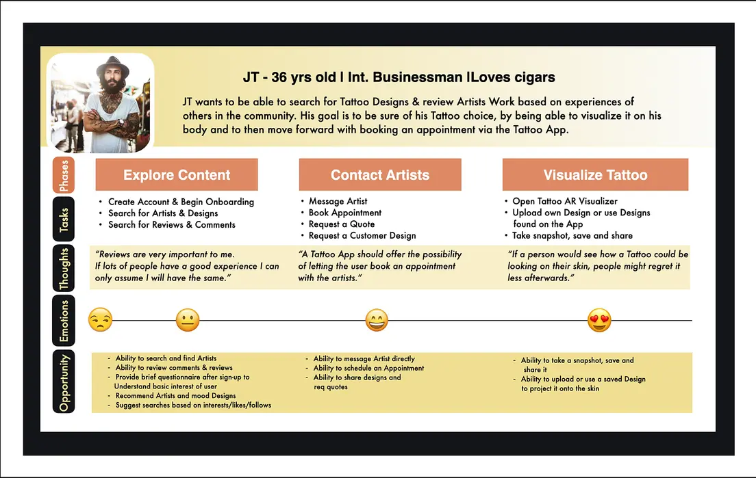
As a result of the research and insights gained, two user personas, JT and Kristy, were created to provide a deeper understanding of our target users. These personas, JT and Kristy, will guide the product development process, ensuring that the app caters to their specific needs and preferences. Here is an overview of their characteristics and journey maps.
Throughout the product development process, JT and Kristy's personas will serve as reference points, ensuring that the app's features, user interface, and overall experience cater to their specific needs, providing a valuable and engaging platform for tattoo enthusiasts like them.
Personas
User Journeys
To navigate through the carousel please "swipe left" (to get back "swipe right")
Taking into consideration the personas and their specific needs, user flows were meticulously designed to outline each step toward achieving a user's goal. This ensures that every aspect of the personas' journey is accounted for and their needs are met at every point. Here is an overview of the user flows.
The user flows to ensure that both JT and Kristy can seamlessly navigate the app, fulfilling their specific goals and addressing their unique needs at each stage of the process. By considering these user flows, the app can provide a user-centered experience that maximizes satisfaction and engagement for all users.
User Flows
To navigate through the carousel please "swipe left" (to get back "swipe right")
To navigate through the carousel please "swipe left" (to get back "swipe right")
Card sorting can provide valuable insights into participants' thought processes.
To gain a better understanding of user expectations and preferences regarding the sitemap design, I conducted an open card sorting experiment. With a clear vision of the necessary features, the goal of the open card sort was to gather information on participants' perceptions of the appropriate locations for these features within the sitemap.
The process involved providing participants with a set of cards representing different features and functionalities of the app. Participants were then instructed to organize these cards into meaningful categories and label them accordingly. This exercise allowed me to gather valuable data on how users mentally organize and prioritize the app's features.
By analyzing the results of the card sorting experiment, I gained insights into users' mental models and expectations regarding feature placement. This information will be instrumental in designing an intuitive and user-friendly sitemap that aligns with users' cognitive patterns and enables easy navigation within the app.
Card Sorting
Concepting
It took your participants a median time of 10:09 to complete
the study.
Germany 60%
United States 20%
United Kingdom 10%
The sitemap was created to provide a visual representation of the app's overall structure. It serves as a blueprint for organizing the app's various sections and features. The initial draft of the sitemap was developed using the insights gathered from the research conducted thus far.
The primary goal of the sitemap is to ensure a logical and intuitive flow for users as they navigate through the app. It outlines the hierarchy and relationships between different pages, screens, and functionalities. The sitemap acts as a guide for developers and designers, ensuring consistency and coherence in the app's structure.
As the development process progresses, the sitemap may undergo refinements and iterations based on user feedback and further research findings. This iterative approach allows for continuous improvement and optimization of the app's structure to enhance the overall user experience.
By visualizing the app's structure through the sitemap, the development team can gain a comprehensive overview of the app's components and ensure a cohesive and user-centric design.
Sitemap

Utilizing insights from the discovery stage, I employed a whiteboard to sketch the app's layout, creating paper prototypes for clear communication within the team and early user feedback. These low-fidelity representations facilitate the swift exploration of diverse design options, screen arrangements, and navigation flows. Sharing these sketches helps gather valuable input, ensuring the app's design meets user expectations. These initial prototypes lay the groundwork for more polished wireframes and mockups, guiding the team in development and streamlining decision-making.
Sketching
Wireframes

Low-, Mid- & High-Fidelity
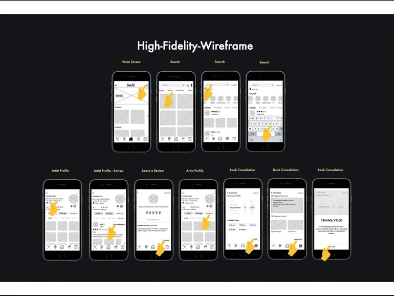
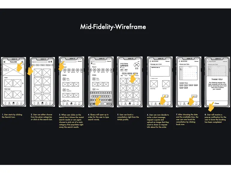
With the preliminary research conducted, I commenced the design process by creating low-fidelity ink-on-paper wireframes, adhering to a mobile-first approach. Through iterative iterations, I gradually advanced toward a higher-fidelity prototype. At each stage of fidelity, I conducted usability tests to either confirm the validity of design choices or uncover potential issues requiring attention. This iterative approach allowed for continuous improvement and refinement of the prototype based on user feedback and testing outcomes.
To navigate through the carousel please "swipe left" (to get back "swipe right")
To identify errors and enhance the design, a series of moderated in-person usability tests were conducted with 6 participants. The participants were given scenario-based tasks to perform, allowing for observation and analysis of their interactions with the prototype. The test results were then analyzed using affinity maps and a rainbow spreadsheet methodology. This analysis facilitated the identification of common patterns, user pain points, and areas for improvement, informing subsequent design iterations and ensuring a user-centric approach to refining the app's usability and overall user experience.
Usability Testing
Testing


Throughout the course of the project, I observed that the use of a brighter yellow color provided a more refreshing and vibrant experience for the user.
A/B Testing
One user feedback highlighted that the buttons (register and Facebook) on the signup screen appear visually similar to the input field, causing confusion about the intended action and grouping.
Sign-Up Screen
Screen B - Result 52%
Screen A - Result 47%
Wireframe
Although Screen B emerged as the preferred choice based on the testing results, it revealed that there is still ample opportunity for improvement. User feedback on Screen B indicated the absence of Social Media options and an action button for submitting the information. These insights highlight the need to address these missing elements to enhance the overall user experience and ensure a more comprehensive and user-friendly signup process.
Conclusion

The objective was to create an artist profile that provides users with all the necessary information without overwhelming the screen with excessive clutter. The goal was to strike a balance between presenting essential details and maintaining a clean and organized design.
Artist Profile
Screen B - Result 67%
Screen A - Result 33%
Wireframe
The testing results unequivocally demonstrate that users prefer Screen B. The split-screen layout not only imparts a cleaner aesthetic but also directs the focus toward the artist's portfolio work, which is highly valued by users. This design choice enhances the overall user experience and showcases the artist's talent and expertise effectively.
Conclusion
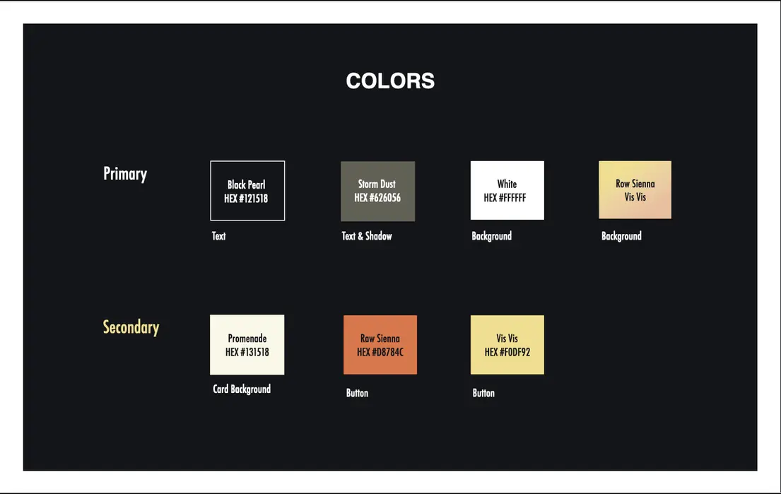
Before revamping the high-fidelity screens, I developed a comprehensive design language document. This document serves as a reference for designers and developers, providing them with a set of guidelines and standards to facilitate smoother communication and ensure design consistency throughout the project.
By defining the visual elements, such as color palettes, typography, iconography, and spacing, the design language document establishes a cohesive and unified look and feel across the app. It also outlines the principles and best practices to be followed in terms of layout, interaction patterns, and accessibility considerations.
Having a design language in place streamlines the design process, enables efficient collaboration, and promotes a cohesive user experience. It serves as a valuable resource for the project team, ensuring that design decisions align with the established standards and maintain a consistent visual language throughout the app.
Design Language
UI Design
To navigate through the carousel please "swipe left" (to get back "swipe right")
Log-in

Home Screen

Search Screen

Artist Profile

Using the new data and feedback received, I carefully analyzed the information and made the necessary changes to refine the design. This iterative process allowed me to address any issues or areas for improvement identified. By incorporating user feedback, I focused on enhancing the overall user experience, ensuring consistency, usability, and visual appeal. Through continuous iteration and refinement, I aim to create a final design that meets user needs and aligns with project goals.
Iteration & Refine


